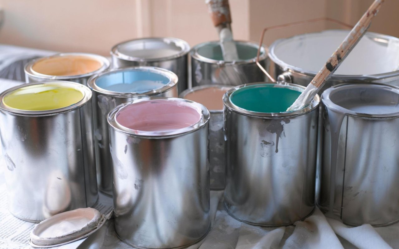
Color doesn’t just change how your home looks—it changes how it feels. Whether you're prepping your house for the market or refreshing a space to better reflect your lifestyle, choosing the right paint colors can have a powerful effect. For homeowners in Madison, understanding color psychology in decor can help you create a home that feels inviting, peaceful, and tailored to your lifestyle.
From calming blues to energizing yellows, color influences mood, behavior, and even how spacious a room appears. Here’s how to use mood-enhancing colors to design interiors that feel just as good as they look.
What Is Color Psychology and Why Does It Matter?
Color psychology is the study of how different hues influence our emotions and mental state. It plays a key role in interior design—affecting everything from productivity in a home office to how relaxed you feel in your bedroom.
In Madison, where homes range from modern new builds to historic properties with character, applying color psychology in decor allows homeowners to complement architectural style while also creating intentional spaces. Instead of selecting colors based on trend alone, think about how each room is used and the kind of feeling you want to evoke when someone walks in.
In Madison, where homes range from modern new builds to historic properties with character, applying color psychology in decor allows homeowners to complement architectural style while also creating intentional spaces. Instead of selecting colors based on trend alone, think about how each room is used and the kind of feeling you want to evoke when someone walks in.
Warm vs. Cool Colors: Know the Basics
Before diving into room-by-room recommendations, it helps to understand the fundamental difference between warm and cool colors:
- Warm colors (like reds, oranges, and yellows) tend to energize a space. They evoke warmth, passion, and vibrancy, making them ideal for social areas.
- Cool colors (such as blues, greens, and purples) create a more calming, relaxed vibe. These are often used in bedrooms, bathrooms, or spaces where a sense of tranquility is desired.
Neutral tones—like gray, beige, or soft white—can balance these effects and serve as a versatile backdrop for accent pieces or bolder color choices.
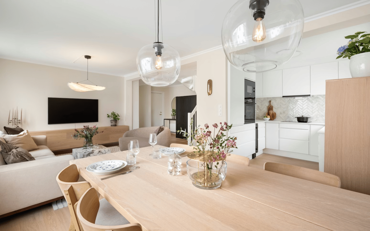
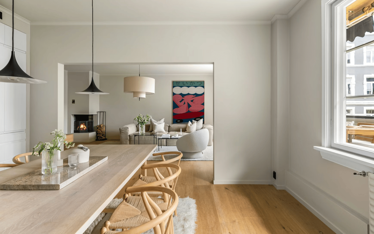
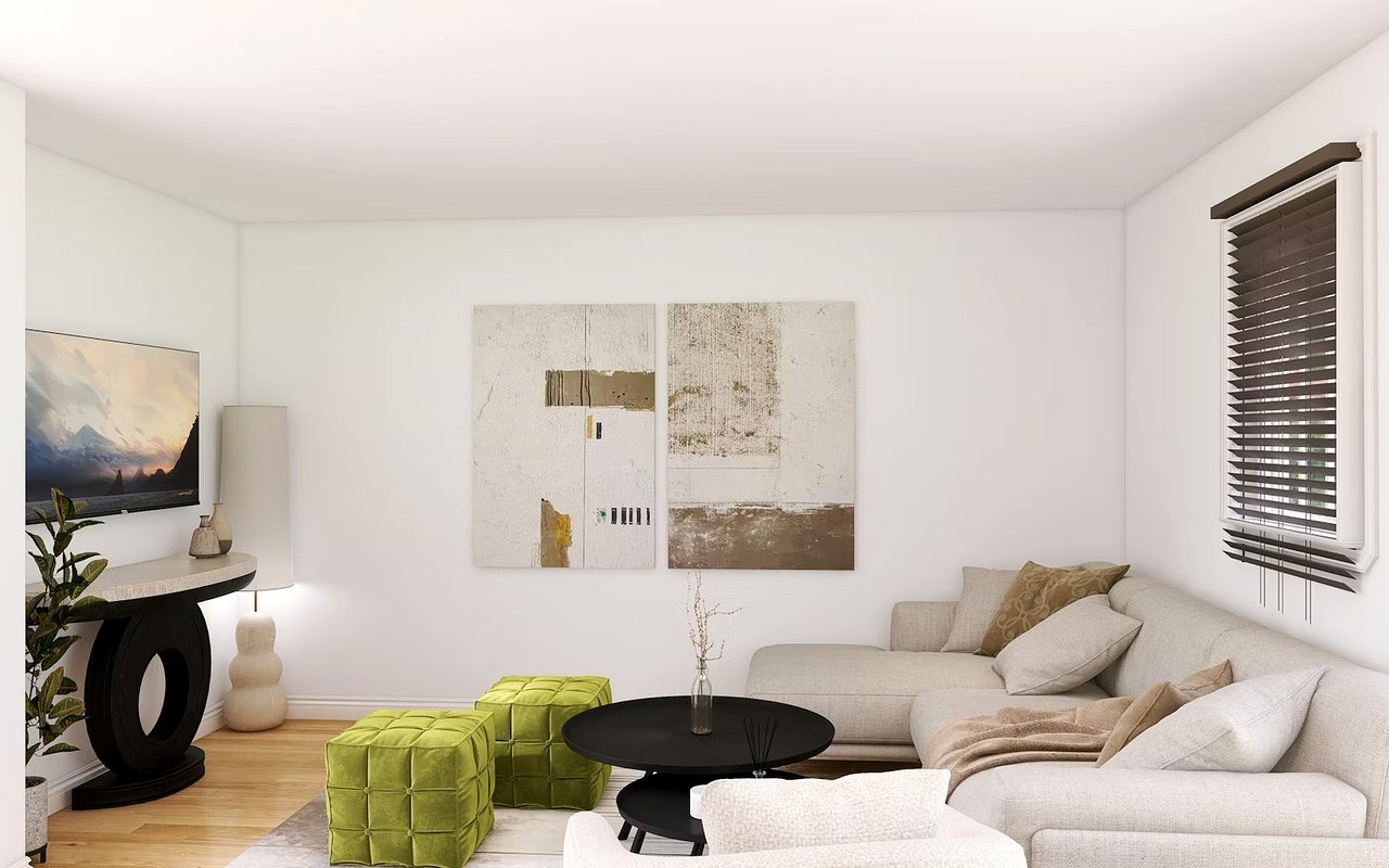
Living Room: Inviting and Comfortable
The living room is often the most social area of the home, where families gather, guests are entertained, and day-to-day life unfolds. For this space, consider using mood-enhancing colors that create a sense of warmth and openness without feeling overwhelming.
Earth tones like warm taupe, soft olive, or muted terracotta work well in many Madison homes and pair beautifully with wood floors or natural light. If you want a more vibrant feel, consider a deep navy or slate blue accent wall, as it adds depth while still keeping things sophisticated.
Avoid using overly bold shades like cherry red or neon colors in large doses; they can become overstimulating in a shared space over time.
Kitchen: Energizing Yet Balanced
The kitchen is a functional space, but it’s also a hub of activity—and the right colors can subtly encourage energy and conversation. Soft yellows, pale sage greens, or creamy whites bring in brightness and warmth without overpowering the room.
Because Madison homes often have open floor plans where kitchens blend into dining or living areas, it’s important to select colors that create continuity. Cool undertones, like gray-blue or misty green, keep things feeling fresh and modern, especially when paired with natural wood or stone finishes.
If you’re feeling bold, colored cabinets in matte navy or forest green can make a stylish statement without sacrificing the benefits of color psychology.
Bedroom: Calm and Restorative
The bedroom is your personal retreat, and the colors you choose should support rest and relaxation. Cool shades like soft blues, light grays, and muted greens are classic choices for creating a tranquil environment.
In Madison’s warmer months, these cool hues can also help a room feel more refreshing and spacious. For a cozier feel during winter, layer in deeper tones—like charcoal, moss, or plum—as accent colors through textiles or accessories.
Avoid bright, high-energy colors like bold red or electric yellow in bedrooms, as they can make it harder to wind down at the end of the day.
Bathroom: Clean, Refreshing, and Serene
Bathrooms benefit from colors that promote cleanliness and calm. Whites and off-whites remain popular for their spa-like feel, but adding hints of light blue, sage, or pale gray can keep the space from feeling too sterile.
In smaller homes, bathrooms may not have much natural light, so sticking with lighter tones can help the space appear larger and more open. Accent with black or navy fixtures to create contrast and depth without overwhelming the senses.
In smaller homes, bathrooms may not have much natural light, so sticking with lighter tones can help the space appear larger and more open. Accent with black or navy fixtures to create contrast and depth without overwhelming the senses.
Home Office: Focus and Productivity
With more people working from home, the design of a home office matters more than ever. Choose colors that encourage focus without being too visually distracting. Mid-tone blues, dusty greens, and soft grays are ideal for fostering concentration.
If you need a bit of creative energy, incorporate pops of orange or yellow through artwork, rugs, or storage accessories. These mood-enhancing colors can help combat mental fatigue during long workdays—something anyone working remotely in Madison’s growing tech and business sectors can appreciate.
If you need a bit of creative energy, incorporate pops of orange or yellow through artwork, rugs, or storage accessories. These mood-enhancing colors can help combat mental fatigue during long workdays—something anyone working remotely in Madison’s growing tech and business sectors can appreciate.
Entryway or Hallways: Welcoming and Bright
While often overlooked, the entryway sets the tone for the entire home. Light, warm neutrals like soft beige, creamy white, or even pale peach offer a welcoming first impression. These spaces are also great places to experiment with bolder colors, since they’re typically smaller and used briefly.
A deep blue or hunter green can add a refined, dramatic touch to hallways or entry nooks while still aligning with overall color psychology goals.
A deep blue or hunter green can add a refined, dramatic touch to hallways or entry nooks while still aligning with overall color psychology goals.
Using Color to Highlight Architectural Features
In many Madison homes—especially historic or custom builds—there are unique details like trim work, archways, or built-in shelving that deserve attention. Use color to highlight these architectural features. Painting trim in a crisp white or contrasting shade can add definition, while a subtle wall color behind shelving can create depth.
Color isn’t just about mood—it’s also about emphasis and visual flow. Done well, it draws attention to the right places and creates cohesion throughout the home.
Color isn’t just about mood—it’s also about emphasis and visual flow. Done well, it draws attention to the right places and creates cohesion throughout the home.
Work with The Dollarhide Team to Enhance Your Home
Understanding color psychology gives homeowners the tools to make smarter design decisions that go beyond aesthetics. Whether you're planning a renovation, preparing to sell, or simply want to create a more enjoyable space to live in, the right color choices can make all the difference.
If you're ready to transform your home with the power of mood-enhancing colors or want expert guidance on getting your property market-ready in Madison, contact The Dollarhide Team. Their local experience and eye for detail will help you showcase your home’s full potential—from curb appeal to color palette.
If you're ready to transform your home with the power of mood-enhancing colors or want expert guidance on getting your property market-ready in Madison, contact The Dollarhide Team. Their local experience and eye for detail will help you showcase your home’s full potential—from curb appeal to color palette.
Other Recommended reads: